Small Logos on Apparel: Keep Fine Lines and Lettering Readable
A logo can look excellent on a large screen and become difficult to read on a garment. Review the design at the intended decoration size before deciding which details to keep.
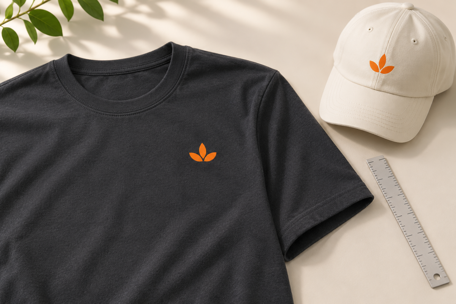
Judge the logo at its finished size
Enlarging a file on screen makes thin lines and small type easy to see. That view can hide the real question: will the design communicate clearly when it is only a small mark on a chest, sleeve or cap? Start with a proposed width in inches or centimetres.
View or print a paper reference at that physical size to assess the layout. A paper preview is useful for readability, although it does not simulate the final fabric or decoration. Check the main mark first, then the smaller wording and any delicate elements.
Decide what the mark needs to communicate
A small logo rarely needs to carry every detail from a website header or business card. The main symbol and business name may be enough. A tagline, phone number or secondary line can compete for limited space and become too small to be useful.
If you have a simplified approved logo version, send it with the full version. If you do not, ask about the options before making changes. Removing wording or altering the symbol should be a deliberate design decision, not an unnoticed consequence of shrinking the file.
Look at spaces as well as lines
Check the open areas between letters and inside the symbol. Closely spaced details can lose their separation when reduced. Fine decorative lines, tightly packed initials and small reversed lettering deserve particular attention.
Rather than prescribing one minimum size for every design, review the actual artwork with the product and proposed decoration method. Two logos with the same overall width can have very different levels of detail.
Compare the artwork with the garment colour
Good contrast helps the important parts of the mark stand out. A subtle tone-on-tone design can be intentional, but it needs a different readability expectation from a high-contrast logo. Make that choice clear in the brief.
Check all garment colours included in the order. A dark logo version may work on cream while a light version is needed for charcoal. Our garment colour guide explains how to organize those combinations.
Review the method and surface together
A printed chest mark and an embroidered cap logo are different applications. Fabric texture, seams and the product's shape affect how the design is approached. Send the exact product or a clear product reference rather than requesting a small logo in isolation.
A design may need a different treatment for each item in a collection. Ask for a recommendation based on the actual artwork and order, and review any proposed simplification before approval. Avoid assuming a logo that worked on one product will transfer unchanged to another.
Choose a placement with enough usable space
Pockets, zips, seams and panels can limit the intended position. A left-chest logo on a plain shirt is a different brief from a mark beside a pocket or on the front of a cap. Check the layout against the actual garment.
Our logo placement guide covers common positions. If the order spans youth and adult styles, ask whether different artwork dimensions are needed rather than automatically applying one size across the range.
Approve the file and written dimensions together
Provide the best original artwork available. A clean source file makes review easier, but file quality and design readability are separate issues: a perfectly sharp file can still contain lettering that is too small for its intended application.
On the proof, check the artwork version, product, colour, location and written decoration dimensions. If a detail looks unclear, ask whether it comes from the preview or the source design. Use our mockup approval checklist before approving the finished specification.
