Artwork & Design
Brand Colour Matching for Custom Apparel: Pantone, Ink & Thread
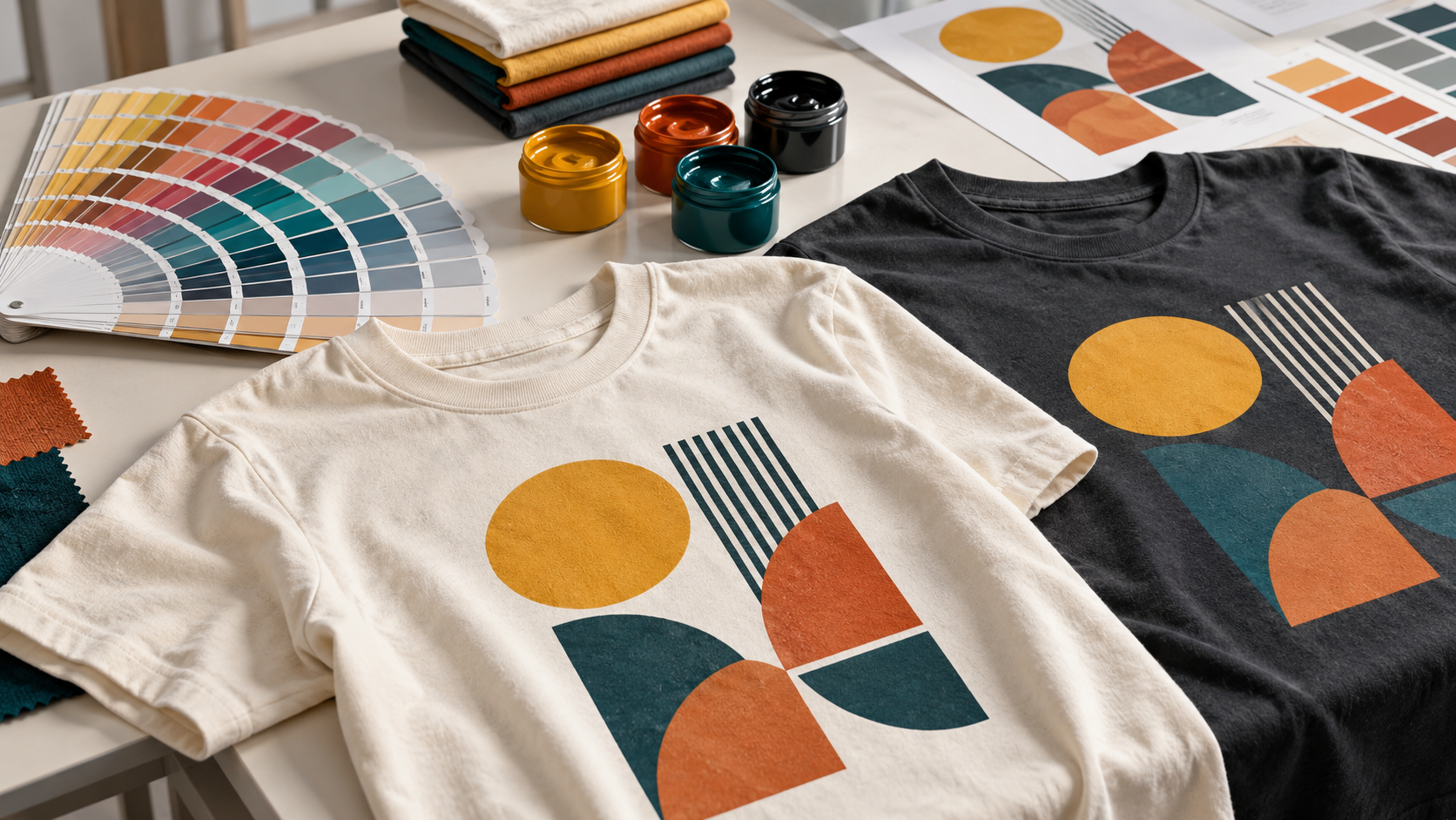
A logo that looks bright blue on a laptop can look different on a navy hoodie. That does not automatically mean the artwork or printing is wrong: light, ink, thread and fabric reproduce colour differently. If you are ordering custom apparel in Vancouver, Burnaby or anywhere in Canada, a clear colour reference helps turn your brand guidelines into a more consistent finished garment.
Why your screen is not a colour proof
Phones and monitors display RGB colour using light. A printed garment reflects light from physical ink and fabric. Screen brightness, display settings and the room lighting can all change what you see. A screenshot or hex code is useful for discussing a colour, but it cannot show exactly how that colour will appear on cotton, fleece or polyester.
Start with the original vector logo and your brand guidelines. Tell the print shop which colours are essential to your identity, and which can be matched approximately. This prevents a proof approval from becoming a guess based on two different screens.
How Pantone references help
The Pantone Matching System gives designers and printers a shared physical reference. Supply the full colour code and reference type from your brand guide, rather than a colour name such as “royal blue.” If you have a physical sample from a previous order, include that too.
A reference improves communication; it does not make every fabric and process identical. Garment colour, ink opacity, curing and the surface texture can influence the final result. When the match is critical, ask about a physical sample or production test and any extra cost before the full run.
Screen printing, DTF and embroidery match differently
Screen printing: spot-colour inks can be selected or mixed toward a specified reference. It is a useful option for solid brand colours and repeat designs. A dark garment may need an underbase, which also affects how the top colour appears.
DTF printing: a full-colour transfer is well suited to gradients and detailed artwork. Its colour gamut and output depend on the printing workflow. Some brand colours can be reproduced closely, while fluorescent or especially saturated references may require a compromise. Discuss colour expectations before approving a screen proof.
Embroidery: thread is selected from available manufacturer shades rather than mixed like ink. Its sheen, stitch direction and lighting can change its appearance. Request the closest thread reference and a stitched sample when colour consistency is particularly important.
The garment colour matters too
“Black,” “natural” and “heather grey” are not identical across every apparel brand. Heather fabrics add visible fibres, and dye lots may vary. For a coordinated team order, choosing one garment style and colour is usually easier to keep consistent than combining unrelated blanks.
- Original vector artwork and the intended print dimensions.
- Full Pantone references, thread references or an approved physical sample.
- Garment brand, style and colour for every item.
- Which colours need the closest possible match.
- Whether a physical sample is needed before production.
Keep a record for repeat orders
Save the approved artwork, garment details and colour references together. If you change from a T-shirt to a polyester jacket, or from printing to embroidery, ask for the colours to be reviewed again. That small step helps avoid expecting a new process to reproduce an old result automatically.
Read our artwork preparation guide before sending files, or compare screen printing and DTF to choose a decoration method.
